 |
| Half Title |
 |
| Contents Page |
 |
| The entire 160-page book was designed as spreads rather than pages. No two spreads were exactly the same. This spread shows the same model used in the painting on the left for Tomboy, but also in the (larger) first printing of The Heller on the right. Additionally, it showcases a later printing of The Heller painted by Bama, but using a different model. The use of color backgrounds, color proofs, covers and photographs allowed for more creative designs. |
 |
| The Harrad Experiment sold millions of copies -- based on the cover art alone. That distinction demanded that it have its own spread. Bama's photographs were used not just as a design element, but to allow viewers to see how they informed the art. Though certainly a Realist, Bama is not a Photorealist, which is evident when one critically compares the photos with the final painting. |
 |
| In addition to covers and color proofs I had hundreds of photo negatives taken by Bama during modeling sessions. Including these photos (some using different models) gave me the opportunity to examine Bama's creative process. |
 |
| Chapter breaks were designed to establish both a visual theme and color scheme. |
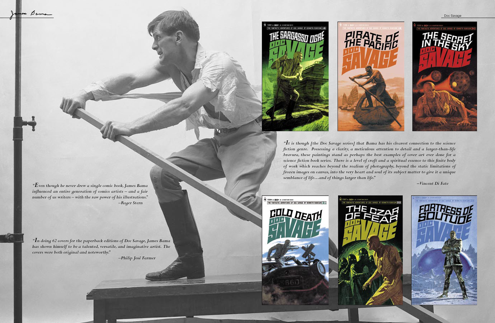 |
| For this project I had to restore every book or magazine cover back to mint condition. This meant that every title, author's name, caption, price point, and logo was digitally recut. In certain cases, as with this photo, the artifact on the left fell out of frame once the image was enlarged to fit the spread, so I moved it into frame to enhance the design. |
No comments:
Post a Comment
Note: Only a member of this blog may post a comment.