 |
Welcome to my Portfolio! As a freelance artist, writer, and editor I have had the opportunity to work with some amazing people. My portfolio includes not only my personal art, but my work as a book designer, cover designer, photo and art digital restoration specialist, digital colorist, and teacher of digital artmaking for non-artists. I have sixteen years of undergraduate art teaching experience in both traditional and digital artmaking techniques. I have authored three books and dozens of articles on the history of illustration and the history of comics, and my writings have been translated into French, German, Norwegian (Bokmål and Nynorsk), Spanish, Portuguese, Italian, Croatian, and Serbian. I also wrote several sections for the first History of Illustration (2018) textbook for Fairchild Books/Bloomsbury Publishing. For more information please contact me at bmkane1@aol.com |
Monday, February 27, 2017
Home
Book Design -- Book Covers
 |
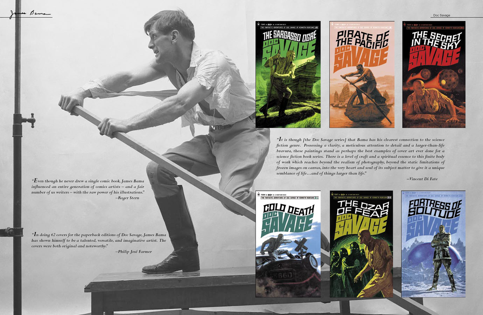
| James Bama: American Realist (Flesk, 2006) The cover art was selected not only because it is an iconic image of Doc Savage, Bama's most recognizable character, but because warm tones attract the eye. The black frame was deliberately chosen to create a physical and visual space between this book and other books when displayed facing out on a bookstore shelf. The same concept was repeated with the spine vignette. |
 |
| Teaching and Learning Emergent Research Methodologies in Art Education (Unpublished) The author supplied the photograph for this cover with the instruction to run a rainbow down the road. |
 |
Prince Valiant, Vol. 13: 1961-1962 (Fantagraphics Books,
2016)
The cover layout for this series was established by the original
designer. As the current Editor of the series, I am responsible for image selection and placement. Images, or in some cases whole pages, are chosen from the 104 Sunday Prince Valiant pages included in each volume. Since each page contains between three to eight panels, the process can be challenging.
Here, Vols. 13 and 15 contain images that represent the various
storylines in each book, while Vol. 14 is thematic of the series. |
 |
| Prince Valiant, Vol. 14: 1963-1964 (Fantagraphics Books, 2016) See the Restoration -- Artwork portfolio for an example of the restoration work executed on one of this cover's panels. |
 |
| Prince Valiant, Vol. 15: 1965-1966 (Fantagraphics Books, 2017) |
 |
| Prince Valiant, Vol. 16: 1967-1968 (Fantagraphics Books, 2017) |
 |
| Prince Valiant, Vol. 17: 1969-1970 (Fantagraphics Books, 2018) |
 |
| Prince Valiant, Vol. 18: 1971-1972 (Fantagraphics Books, 2018) |
Book Design -- James Bama: American Realist
 |
| Half Title |
 |
| Contents Page |
 |
| The entire 160-page book was designed as spreads rather than pages. No two spreads were exactly the same. This spread shows the same model used in the painting on the left for Tomboy, but also in the (larger) first printing of The Heller on the right. Additionally, it showcases a later printing of The Heller painted by Bama, but using a different model. The use of color backgrounds, color proofs, covers and photographs allowed for more creative designs. |
 |
| The Harrad Experiment sold millions of copies -- based on the cover art alone. That distinction demanded that it have its own spread. Bama's photographs were used not just as a design element, but to allow viewers to see how they informed the art. Though certainly a Realist, Bama is not a Photorealist, which is evident when one critically compares the photos with the final painting. |
 |
| In addition to covers and color proofs I had hundreds of photo negatives taken by Bama during modeling sessions. Including these photos (some using different models) gave me the opportunity to examine Bama's creative process. |
 |
| Chapter breaks were designed to establish both a visual theme and color scheme. |
 |
| For this project I had to restore every book or magazine cover back to mint condition. This meant that every title, author's name, caption, price point, and logo was digitally recut. In certain cases, as with this photo, the artifact on the left fell out of frame once the image was enlarged to fit the spread, so I moved it into frame to enhance the design. |
Book Design -- Prince Valiant reprint series
 |
| Prince Valiant, Vol. 8: 1951-1952 (Fantagraphics Books, 2014), pp. 4-5.
In 2013, I became the
editor of the Prince Valiant reprint series with
Volume 7, after assisting
Kim Thompson on the first six volumes. I
just finished my twelfth
volume (Fall 2018). My duties include
writing biographical or
art historical articles, compiling and
annotating backup
galleries, finding artwork for both the front and
back matter (from
international collectors, museums, and libraries),
digitally
restoring photographs and art, creating preliminary layouts,
working with designers and
art restorers, procuring talent to write Introductions, and proofing
the final product before it goes to press.
The series has
appeared on the New York
Times "Best
Sellers"
list, and nominated for
several Eisner Awards.
|
 |
| Prince Valiant, Vol. 8: 1951-1952 (Fantagraphics Books, 2014), pp. 6-7. |
 |
| Prince Valiant, Vol. 12: 1959-1960 (Fantagraphics Books, 2015), pp. 110-111. |
 |
| Prince Valiant, Vol. 7: 1949-1950 (Fantagraphics Books, 2013), pp. 116-117. |
 |
| Prince Valiant, Vol. 14: 1963-1964 (Fantagraphics Books, 2016), pp. 118-119. |
 |
| Prince Valiant, Vol. 14: 1963-1964 (Fantagraphics Books, 2016), pp. 4-5. |
 |
| Prince Valiant, Vol. 15: 1965-1966 (Fantagraphics Books, 2017), pp. 4-5. |
Book Design -- The Definitive Prince Valiant Companion
 |
| Title Page with Credits. The Definitive Prince Valiant Companion was designed to not only be informative, but also visually interesting. For this title page I selected a scene of Prince Valiant with a book. After all, this is a book about a book. The credits were designed as a contemporary scroll. Client: Fantagraphics Books |
 |
| Client: Fantagraphics Books |
 |
| Client: Fantagraphics Books |
Book Design -- Bob Peak: Reflections (unpublished)
 |
| Bob Peak: Reflections was a proposal for a book that never saw print. This is the design for the Title Page. |
 |
| An example of an opening chapter spread. |
 |
| My intention was to design pages with no more than three pieces of art. Here I wanted to control the eye and slow down the pace of the viewer by using images that point to the opposite page. |
 |
| We know in our public consciousness that speed skating and skiing are fast sports. Bob Peak's art beautifully resonates with that sense of kinetic energy. Because our culture reads from left-to-right, I designed this layout to take advantage of that natural flow in order to enhance the drama of this spread. |
Restoration -- Photos
 |
| Remove ink line though figure and face. Client: Vanguard Publications. |
 |
| Digitally splice image back together. Client: Vanguard Publications |
 |
| Correct for chipped areas, cracks, and foxing. Client: Vanguard Publications |
 |
Correct for chipped areas, smudges, reflective gloss then add sepia tint.
Client: Fantagraphics Books
|

Color adjust then remove dirt.
Client: Private customer
Restoration -- Artwork
 |
| This was one of the most demanding and time consuming digital art restorations I have ever executed. The cover was only printed in red and black; however, the halftone color of the haystacks was comprised of interwoven Bed-Day dots (an earlier form of Zip-A-Tone). Client: Fantagraphics Books |
 |
| Client: Flesk Publications |
 |
| Client: Fantagraphics Books |
 |
| Client: Fantagraphics Books |
 |
| Restoring printed pages that are off register is common. Trying to restore a page that has all four channels shifted completely independent of one another on both the X and Y axis is insane. See the panel below for another example from this page, and go to Book Design -- Book Covers for the entire page as it appeared on the cover of Prince Valiant, Vol. 14: 1963-1964. Client: Fantagraphics Books |

 |
| Client: Flesk Publications |

Sometimes color transparencies become corrupted with dirt or there
is loss of color from transparencies sticking to each other.
I have established techniques and the patience to
digitally bring these pieces back to mint
condition -- all with only a mouse.
Client: Flesk Publications
Personal Art
 |
| Four slides from a Power Point presentation showing me drawing and inking Snoopy as part of a multi-media biographic exercise. |
 |
| Batman short story, "As long as there shall exist..." (unpublished). |
 | ||
Batman: Gotham by Gaslight sequel story proposal (unpublished).
|

 |
| Komando and Tuffin in Snoozyland was simply a joke that came to me while visiting the Billy Ireland Cartoon Library & Museum. I thought, "What if Jack Kirby's, Kamandi and Prince Tuftan were really nothing more than characters in one of Calvin's (and Hobbes') bad dreams?" Including the bed from the classic Little Nemo in Slumberland speaks for itself. All of the black & white art is original pen/brush and ink on 2-ply Bristol board. Colors for the first four panels were scanned from old comic books, while the last panel is digitally colored using a palette based on the original comic strip colors. |
 |
| Tarzan Sleeps Brush/pen & ink on 2-ply Bristol board. |
 | ||
| Moonshadow This was a T-shirt design for Null G Sports consisting of three silkscreen plates (white, blue and violet). The blue and violet plates deliberately overlapped to create a fourth color. Once printed on a black T-shirt the bleed-through from the shirt created the silhouette of the hang-glider -- essentially adding a de facto fifth color to the design. The blue and violet plates stacked on the left were made using brush and ink on clear acetate.
|

 | ||||
2014 Family Christmas card. Cover (left panel) and interior (right panel).
|


 |
| Client: Brighter Child Interactive Character designs supplied by client. |
 |
| Client: Brighter Child Interactive Character designs supplied by client. |
 |
| Company Logo -- English Version |
 |
| Company Logo -- Gaelic Version |
 |
| Irish Flag -- Concept 1 |
 |
| Irish Flag -- Concept 2 -- with peace (white) shamrock |
 |
| Irish Yin and Yang with traditional shamrocks |
 | |
|
Subscribe to:
Comments (Atom)